|
Advertisement Assignment
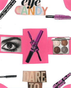
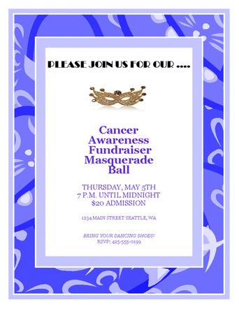
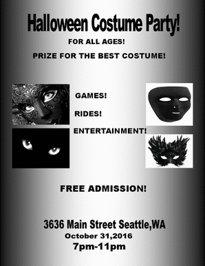
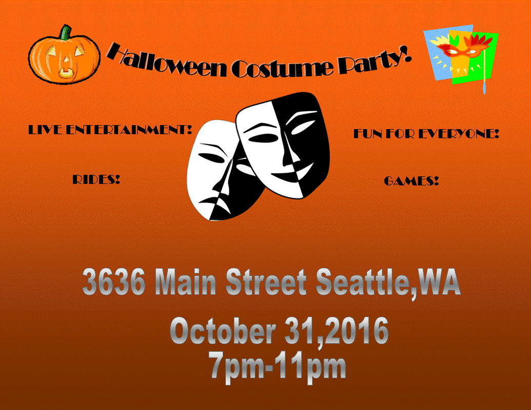
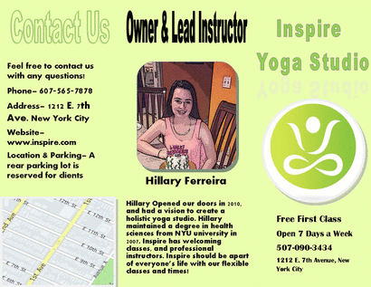
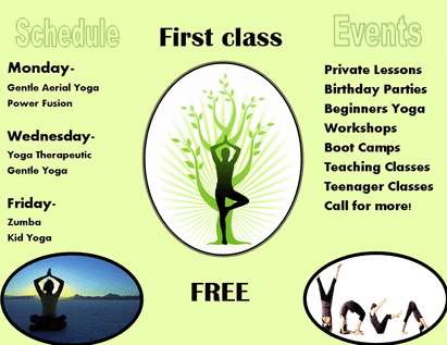
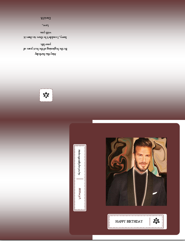
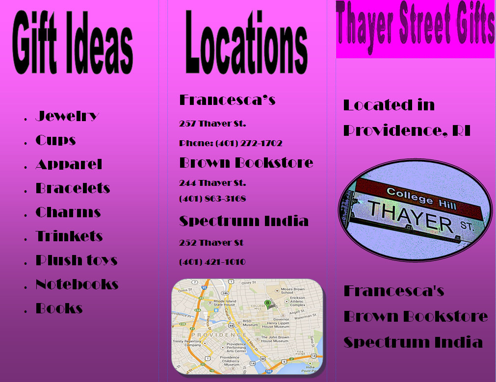
In the advertisement as shown it shows an advertisement for makeup. Also, the project shows balance within the advertisement by having an even amount of photos/pictures on each side. The assignment also shows values of color with all of the color within it by all the items in the advertisement matching. The image also includes qualities of lines with three of the photographs in the center having pink boxes surrounded by them adding to the use of lines in the photo, due to the fact that the two boxes on the sides are the same size which also adds balance to the photo. Also, in the Advertisement it shows an even amount of words/phrases on each side of the advertisement. In the duration of this project I have learned many things. I have learned to look more deeply into advertisements. As for example, I have learned to look more deeply into advertisements and look for the use of many different elements,and how to capture the readers attention. Windshield Flyer Assignment In this assignment the task was to complete 3 different assignments with different criteria in each flyer. In the first image shown the idea was to create an advertisement using a template. The idea was to create an advertisement, while using at least one element and one principle of design. In the advertisement for the fundraiser an element of design used is color. In the advertisement an element of design shown is color. All of the colors go along with each other to make it for the most part an enjoyable image to watch, and make the viewer want to read the flyer. A Principle of design shown in the flyer is balance. All of the words in the flyer balance each other with the amount of words on the flyer. This was created in Microsoft publisher. In the second flyer the assignment is for a flyer made with no template, and with a theme of Halloween. The flyer is described by being a Halloween costume party for all ages. A principle of design shown in the flyer is scale/ proportion. In the flyer the items placed are in proportion to each other so the main focus point is the picture in the middle which attracts the viewers attention. A element of design shown in the flyer is color. The color in the flyer attracts the reader with the bright orange color within the flyer. Also, the flyer has balance within it from the colors all going together, to gain the viewers attention. In the third flyer the idea was to use one of the previous flyers and make them black & white while still making an appealing flyer to consumers. The flyer taken was from the second flyer, while retaining the same information but a different outlook was obtained. This new flyer still has the same idea of a Halloween costume party, but the elements & principles of design have changed completely. The flyer has a new focus point and that being the words placed in the middle of the flyer. The pictures have also been altered to fit the new criteria of a black and white design. The new element of design is shape, due to the fact that all of the shapes have a sense of balance to them and balance out the flyer. The principle of design in the flyer is balance. All of the pictures and words balance each other out to attract the viewers attention. Brochure Project This project involved created a brochure, as well as creating a business of choice to advertise. In this project I created a brochure involving a yoga studio I created. This project taught me how to properly advertise businesses and how to capture the public attention. I also learned what and how to say things that will attract customers to a store. This project was created in publisher. I used boarders around each image to get rid of the harsh edges. I also incorporated elements like the location, what the company offers, operation hours, as well as contact information. Greeting Card Project In this assignment the idea was to create a greeting card from a celebrity. I choose to make a birthday card from David Beckham. The assignment including editing a picture with at least five edits. The first edit I did was liquify the background in order to make David stand out. I also used a warming filter in orange, as well as erased his tie. I also used the filter diffuse glow to get the glowing effect. Lastly, I changed the contrast and brightness to brighten David's face and darken the background. |
|
|
